How to Build a B2B SaaS Dashboard Users Actually Understand
A founder-focused guide to B2B SaaS dashboards: how to design dashboards that users understand and actually use.
Key Takeaways
- 01
Dashboards work best when they answer one question per view, use clear labels, and match how users think.
- 02
Short answer: One question per view, clear labels, match mental models. Less is more.
- 03
Strong dashboard design comes from user-centric organization, not data-centric. Workflow-first.
- 04
Shorter, clearer sections make the article easier to scan and easier for buyers to act on.
- 05
Common founder mistake: Building a dashboard that shows everything. Users get overwhelmed.
- 06
The best next step is usually to list the 3-5 questions users need to answer and design one view per question.
How to Build a B2B SaaS Dashboard Users Actually Understand matters because buyers do not reward software that is only technically correct. They reward software that solves a real workflow, looks credible, and is easy to evaluate. A founder-focused guide to dashboards that users actually use.
If you are researching B2B SaaS dashboards, the useful questions are practical ones: what should be built first, what should be delayed, where does the budget really move, and which tradeoffs are worth making now. That is the frame this guide uses.
Quick answer
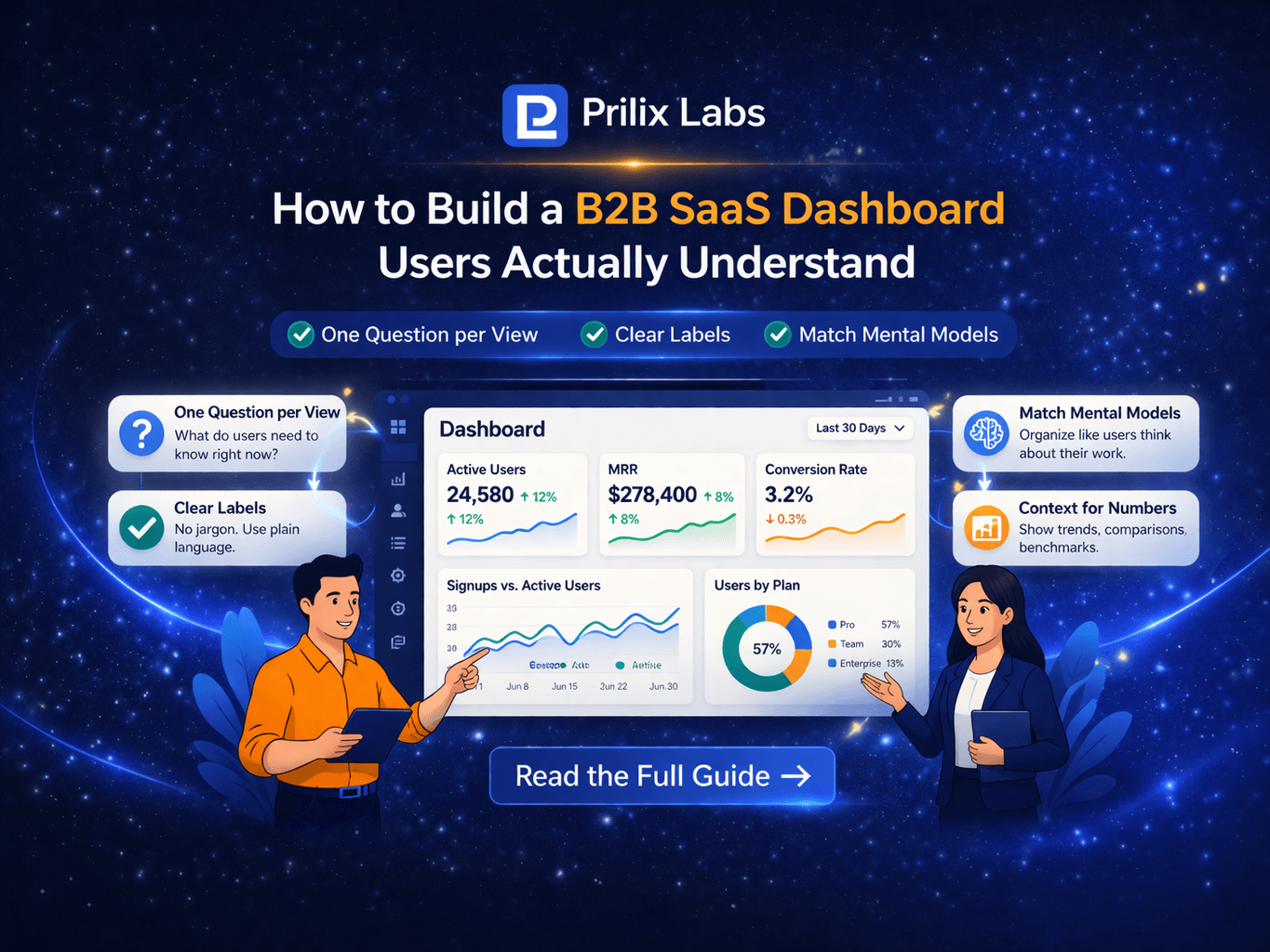
Dashboards work best when they answer one question per view, use clear labels, and match how users think about their work. Less is more.
- One question per view: what does the user need to know?
- Clear labels: no jargon, no abbreviations without explanation.
- Match mental models: organize like users think, not like the data is stored.
Who this guide is for
This article is for founders and buyers building B2B SaaS dashboards.
It is written to help teams build dashboards users actually understand and use.
- Useful when the backlog is larger than the budget.
- Useful when the founder needs to cut scope without losing the product thesis.
- Useful when the first release must support customer conversations, pilots, or revenue.
Dashboard design principles
The goal is not to create more theory. The goal is to show the principles that make dashboards understandable.
| Principle | What to do | What to avoid | Impact |
|---|---|---|---|
| One question per view | Answer one thing clearly | Dump everything on one screen | High |
| Clear labels | Plain language, no jargon | Abbreviations, technical terms | High |
| Match mental models | Organize like users think | Organize like database | High |
| Context for numbers | Show trend, comparison | Raw numbers alone | Med |
| Progressive detail | Summary first, drill-down | All detail upfront | Med |
What makes dashboards understandable
The first release should prove something concrete: that a buyer will care, that a user will adopt the workflow, or that the product can replace a painful manual process. Without that frame, the build drifts into generic software effort.
One question per view
What does the user need to know right now? Design each view to answer one question. Avoid dumping 20 metrics on one screen.
Clear labels
No jargon. No abbreviations without explanation. Use the language users use. "Active users" not "DAU."
Match mental models
Organize like users think about their work, not like the data is stored. Workflow-first, not data-first.
Common founder mistake
The common mistake is building a dashboard that shows everything. Users get overwhelmed. Less is more. One question per view.
Founder note
When the workflow is genuinely custom or operationally messy, early software consulting input can help design the dashboard structure.
Dashboard checklist
- List the 3-5 questions users need to answer.
- Design one view per question. Do not dump everything.
- Use clear labels. No jargon. Plain language.
- Organize like users think, not like the database.
- Add context for numbers: trend, comparison, benchmark.
What to do next
If you are importing these JSON files into MongoDB, this is the content shape you want: clean headings, clear box sections, visible lists, and one practical table.
Apply this in a real project
If you’re planning to build or improve software based on these ideas, our custom software development services can help you define scope, reduce delivery risk, and ship maintainable systems.
For founder-led execution, explore our product development services and web development services to turn requirements into a working release with clear ownership.
Expert Insights
One question per view
Design each view to answer one question. Avoid dumping 20 metrics on one screen. Users get overwhelmed.
Clear labels matter
No jargon. No abbreviations without explanation. Use the language users use. "Active users" not "DAU."
Match mental models
Organize like users think about their work, not like the data is stored. Workflow-first, not data-first.
Reader Rating
Based on 1 reviews
Frequently Asked Questions
What makes a B2B SaaS dashboard understandable?+
What is the biggest dashboard mistake?+
How do I organize a dashboard?+
How many metrics should a dashboard show?+
Should I use technical terms or plain language?+
Reader Questions
How do I know what questions users need to answer?
Ask them. Observe their workflow. What do they check? What decisions do they make? Design for that.
What part of the dashboard should I focus on as a founder?
Focus on the 3-5 key questions. One view per question. Clear labels. Match mental models.
How much should I invest in dashboard design?
Start with the essentials. One question per view, clear labels. Add polish and drill-down when users ask for it.
Related Articles
Technology • 3 min
Why MVPs Fail: 15 Mistakes Founders Make Early
A founder-focused guide to the 15 most common MVP mistakes: what causes failure, how to avoid them, and how to build MVPs that actually validate.
Technology • 3 min
When to Use Next.js, Node.js, Flutter, and Firebase Together
A founder-focused guide to combining Next.js, Node.js, Flutter, and Firebase: when the stack makes sense and how to use them together.
Technology • 3 min
When to Build a Mobile App First vs a Web App First
A founder-focused guide to choosing mobile-first vs web-first: when each makes sense, tradeoffs, and how to decide for your product.